WrITING TASK 1
You should spend about 20 minutes on this task.
Write about the following topic:
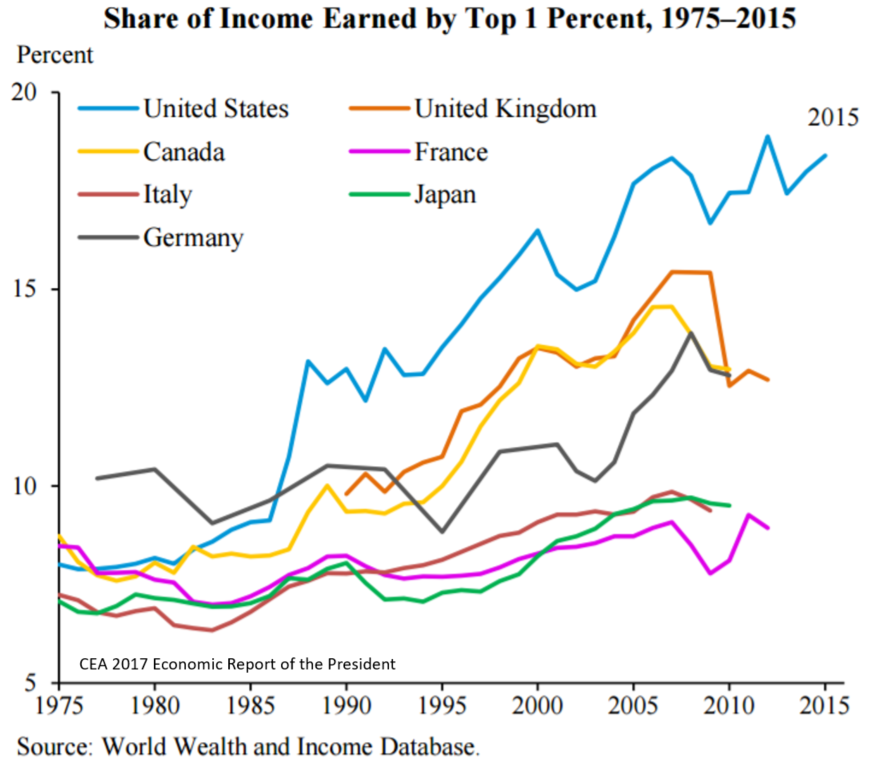
The line chart illustrates the percentage of total income accumulated by the top 1% of earners across seven nations from 1975 to 2015.
Summarise the information by selecting and reporting the main features, and make comparisons where relevant.
Write at least 150 words.